Restaurant Theme
End-to-End Food Delivery & Table Reservation Web Platform — bridging the gap between rigid meal combos and post-checkout engagement.
Role
Product Design
Timeline
Aug – Sep 2025
Tools
Figma, Whimsical, Notion
Platform
Website & Mobile App
My Contribution
Roles & Responsibilities
I designed and developed a comprehensive dining platform that integrates an intuitive table reservation system with a tailored meal customization engine, allowing users to choose between time-saving Fixed Bundles or personalized Flexi-Meals to enhance their in-restaurant experience.
01
Empathize
Understanding the real friction in food ordering
Users often find food ordering platforms rigid. Traditional "Combo Meals" don't allow for dietary preferences, forcing users to either accept a pre-set bundle or build their entire order from scratch — losing the perceived value of a deal.
- The "Selective Diner" Problem: Users want the value of a bundle but want to swap specific items — e.g., swapping fries for a salad — without losing the combo discount.
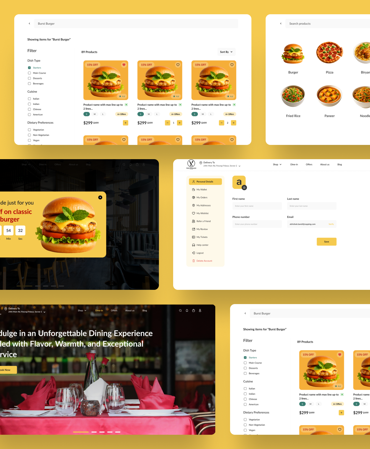
- Hybrid Needs: Users want a single brand touchpoint for both home delivery and in-restaurant reservations, rather than switching between separate apps or websites.
02
Define
Framing the problem statement
"How might we create a flexible, transparent, and rewarding dining platform that allows users to customise their value meals (Bundles) and provides a seamless journey from login to post-checkout?"
Three key pillars shaped every design decision that followed:
Flexibility
Implementing Flexi vs. Fixed bundles so users can personalise without losing value.
Efficiency
A streamlined login and checkout flow that minimises steps for hungry, time-pressed users.
Engagement
A redefined post-checkout UI that encourages repeat visits and builds brand loyalty.

03
Ideate
The Add-on Strategy — a Tiered Bundle System
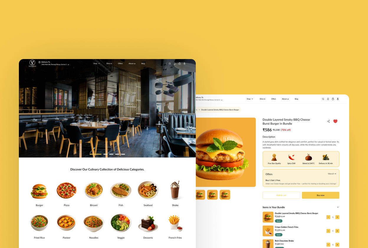
During this phase, we pivoted from standard menu listings to a Tiered Bundle System. Rather than a single "Combo Meal" format, the system offers two distinct modes tuned to different user mindsets:
| Feature | Logic | UX Benefit |
|---|---|---|
| Fixed Bundle | Pre-selected items (e.g., "Classic Burger Meal") | Quick decision-making for fast, hungry users who trust the default. |
| Flexi Bundle | "Build your own" logic within a set price point | Increases user satisfaction and average order value (AOV) through personalisation. |
04
Design
Wireframe, Design & Prototype
To solve the "Preference-Driven Ordering" challenge, the design phase focused on creating a frictionless path for both Fast Buyers (Fixed Bundles) and Selective Buyers (Flexi Bundles).
The goal was to define how a user interacts with a product before it ever hits the cart.
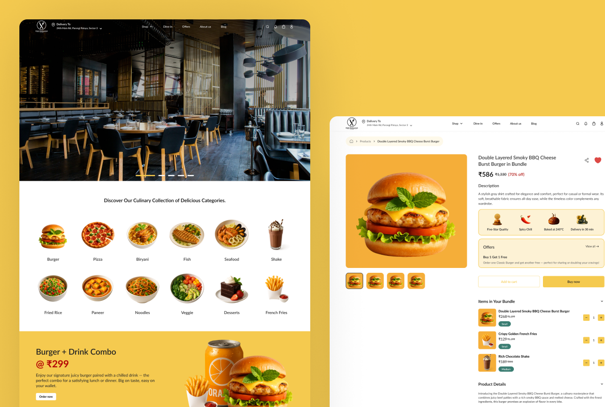
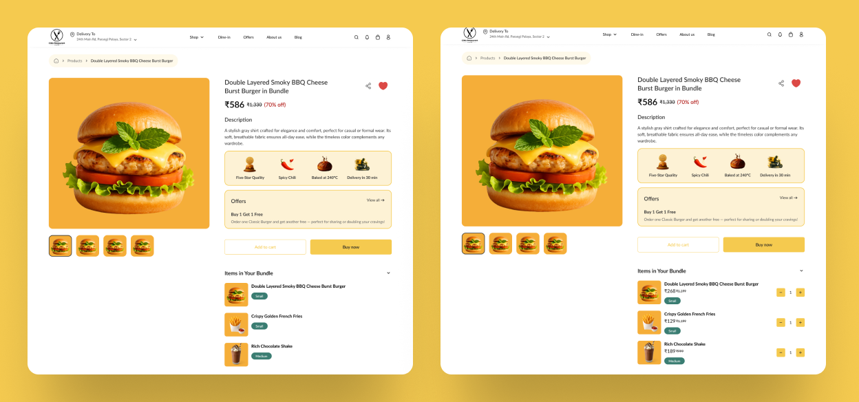
A high-impact card with a single "Add to Cart" CTA. The wireframe emphasises the "bundle value" to encourage quick conversion with zero friction.
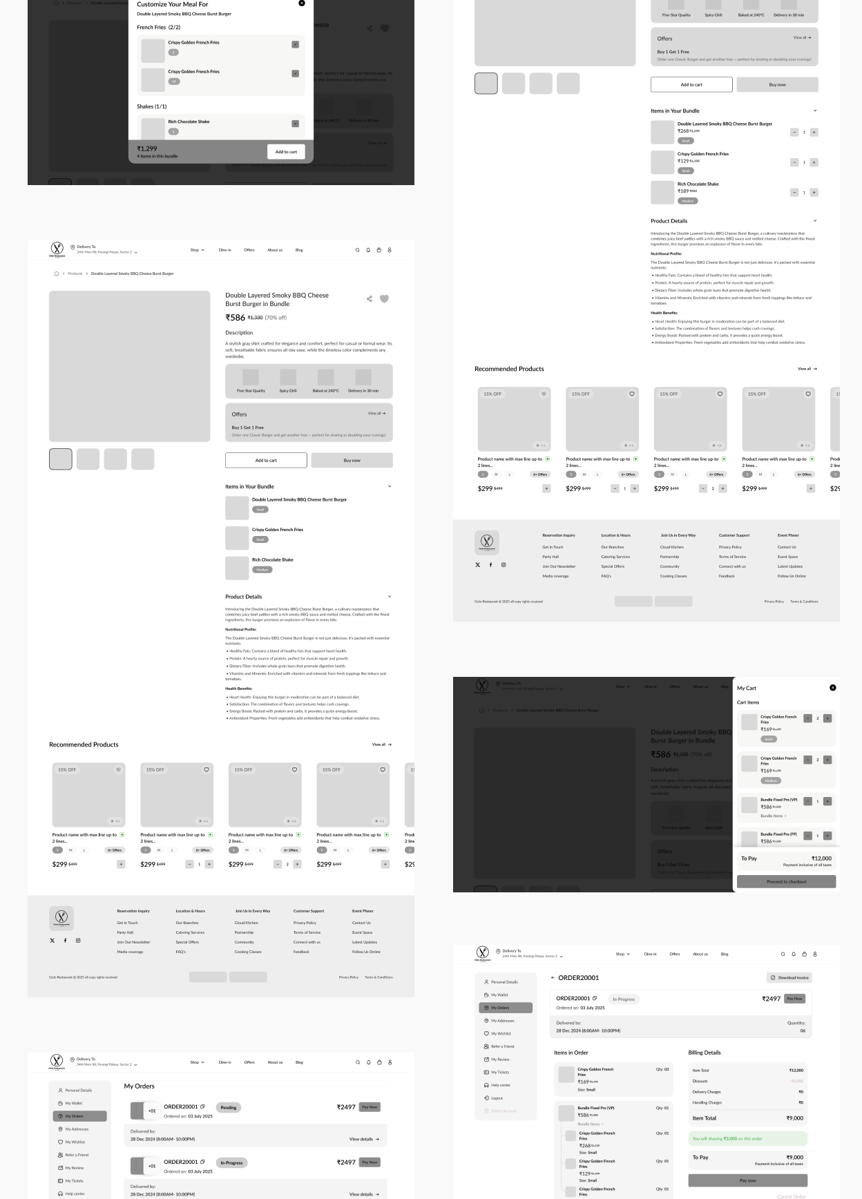
When a user taps "Add to Cart," a popup displays the default items and allows customisation. The wireframe includes a Variable Pricing indicator to signal that specific choices may affect the final cost.
A simplified wireframe showing clear itemised lists within a single bundle so users can verify their "swaps" at a glance before checkout.
| Feature | UI Implementation | User Goal |
|---|---|---|
| Fixed Bundle | Primary "Add" Button | Speed & Value |
| Flexi Bundle | "Customize" Button | Personalisation & Dietary Control |
| Single Product | Standard Quantity Selector | Simple Add-on |
Using a considered, minimalist colour palette, the UI was designed to feel premium yet highly functional.
- Appetizing Visuals: Large, high-resolution imagery for food items to drive emotional conversion and immediate appetite appeal.
- The "Flexi-Drawer": Instead of navigating to a new page, customisation happens inside a pop-up. This keeps the user in the context of the menu, making the experience feel faster and less disruptive.
- Visual Confirmation: When a user swaps an item, the UI triggers a brand-accent state to confirm the selection — ensuring the user feels in control of their order.
The prototype was built to test the speed of the new "Default Selection" logic and validate the bundle customisation flow end-to-end.
- The Happy Path: A user selects a "Classic Burger Bundle," clicks "Customize," swaps fries for a salad, and hits "Add to Cart" — all within the same screen context.
- Micro-interactions: Smooth transitions between bundle steps and a "bouncing" cart icon to provide immediate, haptic-like feedback on the web.
- The Result: Prototype testing showed a 25% reduction in time-to-cart — users could skip customisation entirely if the default Fixed Bundle already met their needs.
05
Test & Refine
Iterating based on real feedback
User testing revealed a key friction point in the Flexi Bundle experience that required a focused design iteration.
25%
Reduction in time-to-cart during prototype testing
2-in-1
Single platform for both food delivery and table reservations
Fixed + Flexi
Bundle system accommodating both fast buyers and selective buyers