FireFlink Mobile App
Translating a data-heavy automation platform into a clean, pocket-sized interface — without losing functional depth.
Role
UI / UX Design
Timeline
Aug 2024
Tools
Figma, FigJam
Platform
Mobile App
01
Context
Extending the ecosystem to mobile
FireFlink is a powerful test automation platform — and the goal here was to bring it to mobile. Not to reinvent the platform's logic, but to translate complex technical workflows into a clean, mobile-first design that feels intuitive for QA engineers on the go.
Translating a data-heavy automation platform into a simple, pocket-sized interface without losing functional depth.
02
Design Approach
Minimalism & Material Standards
My design process was guided by Material Design principles to ensure familiarity and ease of use. I adopted a minimalist approach — stripping away non-essential visual clutter to prioritize the user's immediate tasks.
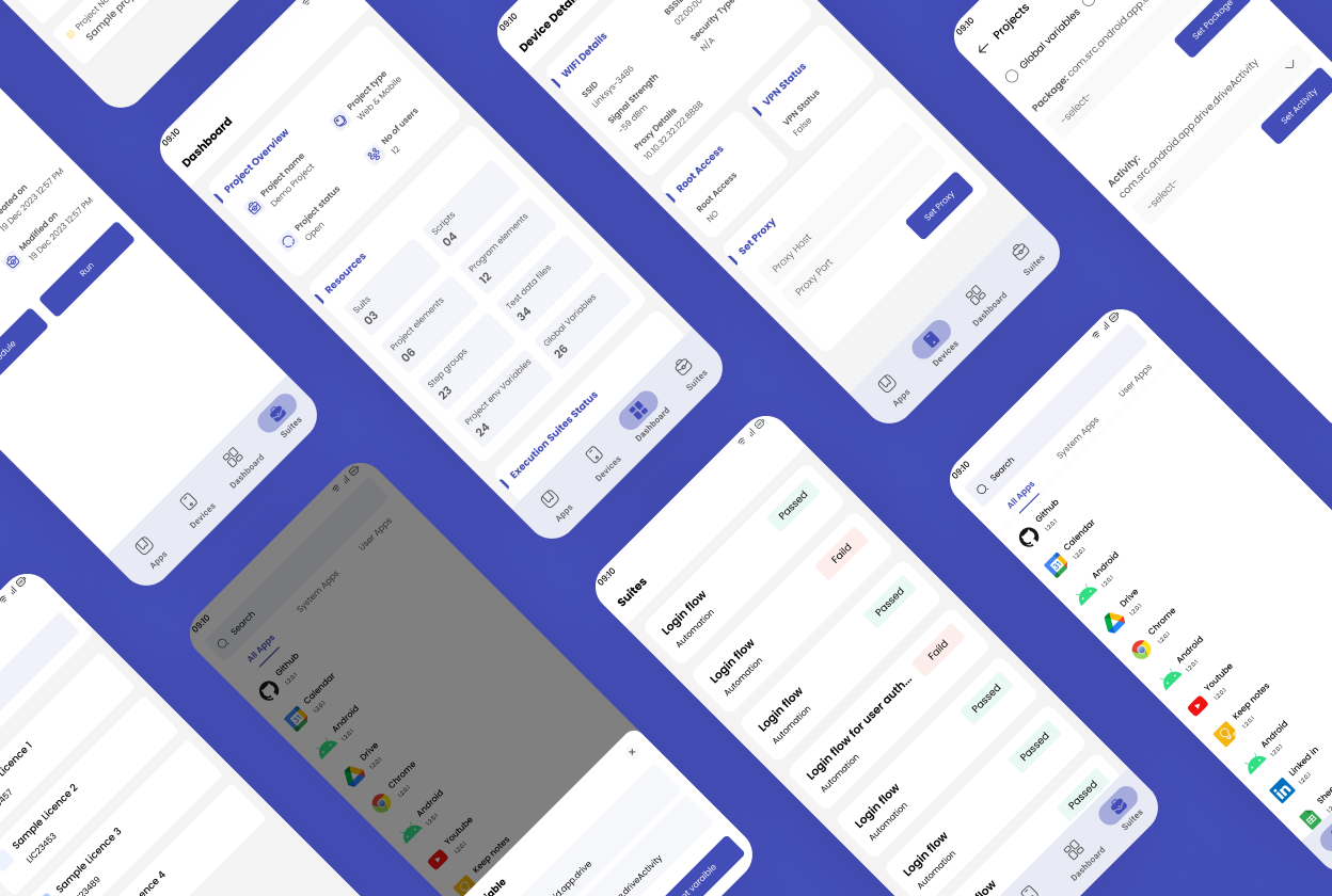
- Clean Typography & Hierarchy — Using varied font weights to distinguish between device labels and active data values
- Card-Based Layouts — Grouping related information into cards makes the interface easily scannable at a glance
- Standardised Navigation — A persistent bottom navigation bar enables instant switching between core app functions
03
Design
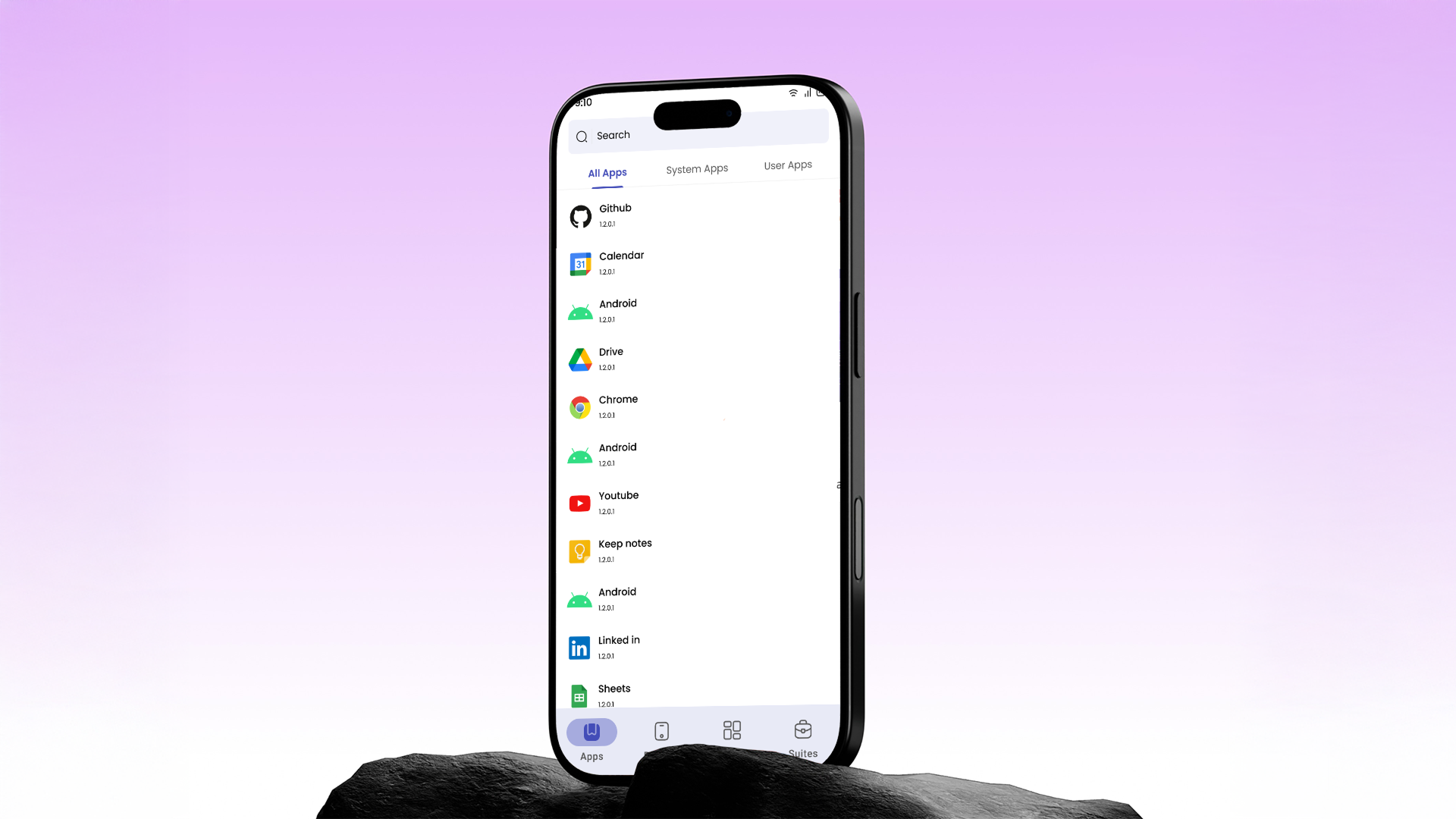
Four functional pillars
I focused on designing a high-fidelity interface that guides the user through four key areas of the app. Each pillar had to work independently while feeling part of the same cohesive experience.
Authentication & Licensing
A streamlined login flow that automatically connects the user to their specific project licenses on sign-in.
Variable Configuration
A "Variable" modal where users set Package and Activity names — mapping mobile apps to their projects in just a few taps.
Device Transparency
A single-page "Device Configuration" view displaying technical stats — Wi-Fi strength, VPN status, Root access — in a highly readable format.
Execution Management
A minimalist dashboard for project resources and execution status, plus a Suite list view where users can Run or Schedule tests via a simple time-picker.
04
Outcome
Efficiency through design
By applying a minimalist Material Design framework, I transformed a complex technical requirement into a user-friendly mobile utility that feels like a natural, lighter extension of the FireFlink ecosystem.
High scannability
Card-based layouts let users find and act on information without friction
Action-oriented UI
Primary actions like "Run" and "Set Variable" are always front and centre — fewer taps to get things done
Seamless integration
The mobile app feels like a natural, lighter extension of the professional FireFlink ecosystem